
Flooring Tips
What Color House Looks the Most Expensive?
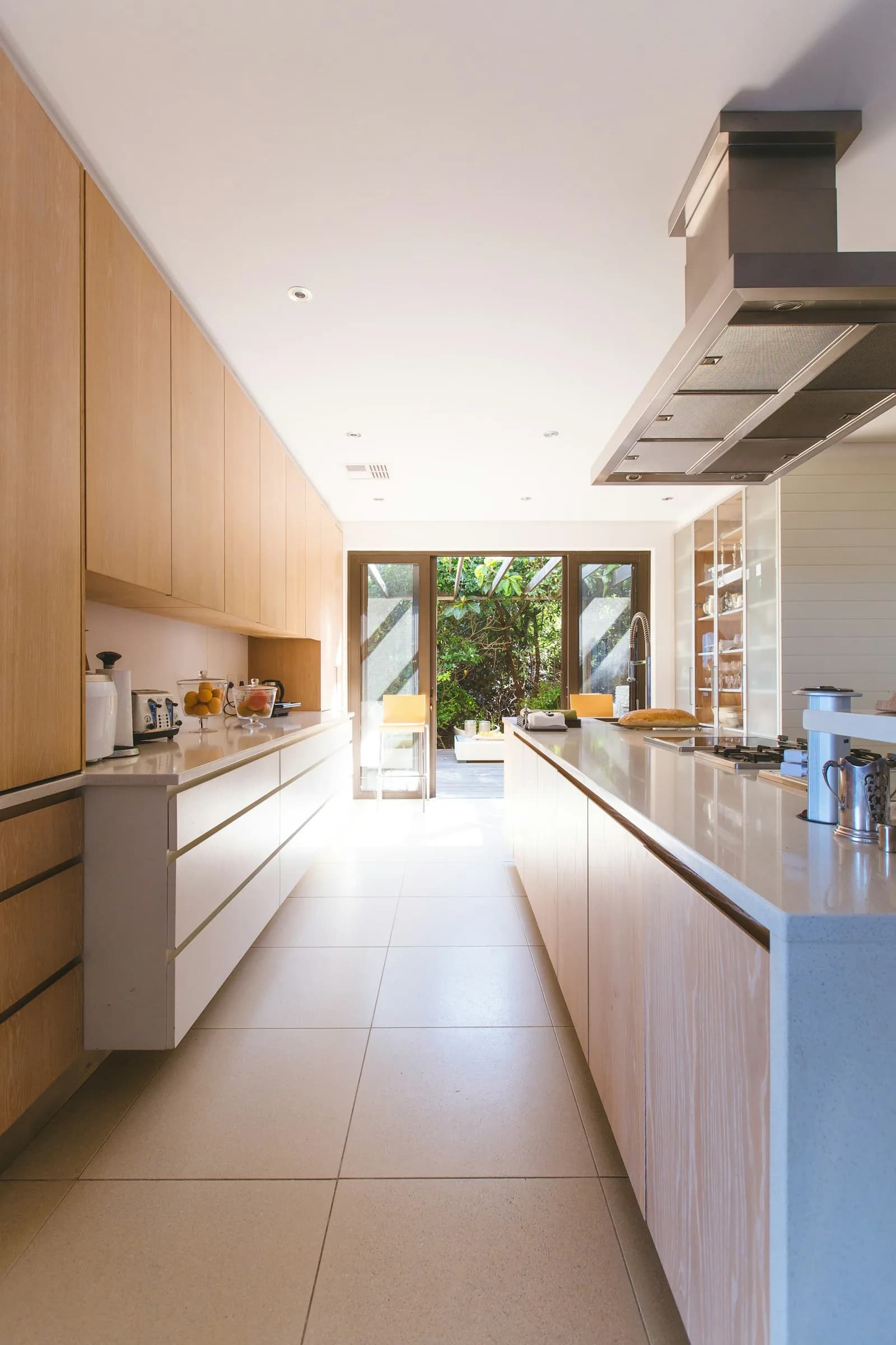
What color house looks the most expensive? Inside, it's warm neutrals, white oak floors, quartz counters, and timeless cabinets used consistently.
- Published
- June 12, 2026
- Author
- Blackburn's Interiors, Winter Haven, FL
- Reviewed by
- Wally Blackburn, owner
What color house looks the most expensive? Search that question and you get a hundred articles about exterior paint: charcoal, greige, black trim, warm white siding. We will be honest with you. We are not exterior painters. We are a flooring, cabinet, and countertop shop. So we are going to answer the question we actually know cold: what makes the *inside* of a home read expensive. Because here is the truth most homeowners learn too late. A house can have a perfect exterior color and still feel cheap the second you walk through the front door. The floors, the cabinet color, and the countertop do more for the "expensive" feeling than any paint chip ever will.
We are Blackburn's Interiors, a family-owned shop in Winter Haven since 1962. Three generations of us have walked Polk County homes: slab-built ranches in Lakeland, new construction in Davenport, lake houses in Lake Wales. We have seen what makes a room look like money and what makes it look like a builder special. The good news is that none of it requires a huge budget. It requires the right colors in the right places, and the discipline to keep them consistent. Here is everything we tell customers at the showroom.
Why Interior Color Beats Exterior Color Every Time
Curb appeal gets a buyer to the door. The inside gets the offer. You spend almost no time looking at your siding. You spend every evening looking at your floor and your kitchen. So that is where the money should show.
There is also a Florida reason. Most homes here sit on a concrete slab, and a lot of them get sold to snowbirds and out-of-state buyers sight-unseen until the showing. When that buyer finally walks in, the floor is the first thing under their feet and the kitchen is the first room they photograph. A warm, consistent interior palette is what makes them feel like the home was cared for. A patchwork of mismatched floors and dated cabinet colors does the opposite, no matter how fresh the exterior paint is.
The Palette That Reads Expensive Anywhere
Step into any home that feels high-end and you will notice the same thing. It is calm. The colors agree with each other. Nothing fights for attention. That calm comes from a warm neutral base, think soft whites, oatmeal, greige, warm taupe, mushroom, with natural wood tones and a little contrast for depth. This is true in a Bartow farmhouse and a Manhattan apartment alike. It is a human response, not a regional trend.
The mistake we see most is cool and cold. Stark blue-gray floors, bright white cabinets with a blue undertone, and a gray-veined quartz can look sharp in a showroom under bright lights. In a real home they read flat and a little clinical. Warm undertones read like money because they read like comfort.
Warm Neutrals, Not Loud Color
Expensive rooms whisper. The walls and big surfaces stay quiet, and color comes in through small things you can swap: a rug, art, pillows, a vase. When the floor and cabinets are a calm warm neutral, you can change the mood of the room for forty dollars instead of forty thousand. That flexibility is itself a luxury. We dig deeper into picking a base tone in our guide to choosing the right flooring.
The Rule of Three
Designers lean on a simple idea: pick about three core finishes and repeat them through the home. A floor, a cabinet color, a counter. Maybe a metal for the hardware and faucet. Repeat those instead of introducing a new color in every room. Too many finishes is the single fastest way to make a home look cheap and busy. We wrote a whole piece on this. See the rule of 3 in flooring, because it is the cheapest upgrade there is. It costs nothing but restraint.
Flooring: The Biggest Color Decision in the House
Your floor is the largest single surface a person sees. It is the canvas everything else sits on. Get the floor color right and the rest of the home has a fighting chance. Get it wrong and you fight it forever.
White Oak Is the Expensive Look
If one floor reads "expensive" in 2026, it is white oak in a warm, natural mid-tone. Not yellow, not gray. A soft honey-to-caramel oak with a matte or wire-brushed finish. It photographs beautifully, it hides Florida's fine sand and dust, and it does not date the way the cool grays of the 2010s did. You can get this look in real hardwood or in a high-quality luxury vinyl plank that mimics white oak almost perfectly. On a slab in our humidity, LVP is often the smarter call, and we explain why in our hardwood vs luxury vinyl plank in Florida breakdown.
A few color rules that make any floor read more expensive:
- Choose warm mid-tones over both pale blonde and cool gray. They have staying power and hide dirt.
- Pick a matte or satin finish, never high gloss. Gloss shows every footprint and screams builder-grade.
- Go wider on the plank. Wide planks (7 inches and up) look custom; narrow strips can look dated.
- Keep the same floor flowing room to room instead of changing color at every doorway.
One warning from years of installs: the cheap version of the right look will betray you. A 6-mil wear-layer vinyl in a pretty oak color still wears through in a few years and starts to look rough. The color was right; the quality was not. Our post on what flooring designers say to avoid covers the specific traps. For where the color trends are heading, see our latest flooring trends and our hardwood flooring trends posts.
Carpet and Tile Still Matter
Bedrooms still feel best with soft, warm-neutral carpet. A greige or warm beige reads cozy and current, while cold gray carpet already looks tired. In bathrooms and entries, large-format tile in a warm stone or marble look adds quiet luxury, especially when you run a bigger tile with a tight, color-matched grout line. Small tile with dark grout chops the floor up and makes a room feel smaller and cheaper.
Cabinet Colors That Look Custom, Not Cheap
After the floor, your cabinets are the next biggest color call. In a kitchen, they may be the most important one. The colors that read expensive are the ones that will still look right in fifteen years.
The timeless, high-end cabinet colors we steer customers toward:
- Soft warm white and creamy off-white: bright without the cold blue undertone.
- Warm greige and mushroom: neutral, calm, and very current.
- Natural white oak cabinets: the same wood logic as the floor, full of warmth.
- Deep, muted greens and warm navies on an island: a confident accent, not a whole-kitchen risk.
- Soft black or charcoal on a lower run, paired with a lighter perimeter, for depth.
What makes them look custom is not the color alone. It is the door style and the consistency. A simple Shaker or slab door in a warm neutral, with the same color on every cabinet and a quiet, well-sized hardware choice, looks far more expensive than a busy two-tone kitchen with three competing finishes. We get into door styles and layout in our kitchen design 101 guide, and into how much real custom work costs in custom vs semi-custom vs stock cabinets. For what is selling locally, see cabinet trends in Winter Haven.
Countertops: Where Cheap Hides and Shows
Nothing dates a kitchen faster than the wrong countertop color, and nothing lifts it faster than the right one. The expensive look here is calm and natural: a warm white or creamy quartz with soft, subtle veining that mimics marble. Not a busy speckled pattern, not a flat builder-grade laminate, not a heavy gray vein that fights the cabinets.
We work mostly in countertops made of quartz, granite, and Cambria. Quartz is usually our pick for the expensive-but-livable look, because the color stays consistent slab to slab and it needs no sealing in our humidity. We lay out the trade-offs in quartz vs granite countertops and why quartz countertops are the perfect choice. If you are comparing the premium quartz brands, our Cambria vs Silestone vs Caesarstone post breaks down the color lines.
A couple of color rules that make a counter look like money:
- Match the warmth of the counter to the warmth of the cabinets. Warm whites with warm whites.
- Choose soft, marble-style veining over heavy speckle; speckled patterns read dated fast.
- Let one surface be the star. If the counter has movement, keep the backsplash quiet.
Consistency Room to Room Is the Real Secret
Here is the thing nobody tells you. The single biggest difference between a home that looks expensive and one that does not is consistency. Expensive homes flow. The same warm floor runs from the entry through the living room, down the hall, into the kitchen. The cabinet color in the kitchen agrees with the vanity in the bath. The metals match. Your eye travels through the home without tripping.
Cheap-looking homes do the opposite. Tile in the entry, a different wood in the living room, carpet that does not match, a kitchen counter that argues with the bathroom. Every doorway is a hard stop. Builders do this to use up leftover materials. It is the clearest tell of a budget job.
You do not need everything to be identical. You need it to belong to the same family of colors. A few ways to get there:
- Run one flooring color through all the main living spaces instead of changing at each room.
- Repeat your cabinet color or wood tone on the bathroom vanities.
- Pick one metal, warm brass, matte black, or brushed nickel, and use it everywhere.
- Keep wall colors within one warm neutral family so rooms feel connected, not chopped up.
This is also where local builders we work with across the communities we serve win listings. A consistent palette photographs better and shows better. If you are unsure which colors flow together, our quick flooring quiz is a painless place to start, or browse real product in our flooring shop.
How Much Does the Expensive Look Actually Cost?
Less than people fear. The look is about color and consistency, not the most expensive product on the floor. A warm, mid-tone white-oak-look LVP runs roughly $5 to $11 per square foot installed in our market. Real engineered hardwood runs about $9 to $16. A quality quartz counter typically lands around $60 to $100 per square foot installed. Warm-neutral semi-custom cabinets cost a fraction of full custom and look nearly identical when the color and door style are right.
Where people overspend is by chasing a trend instead of a timeless color, then redoing it in five years. Pick the warm neutral, pick the quality, and you buy the look once. For real local numbers on a full floor, see our breakdown of what 1,000 square feet of flooring costs, or run your own with our flooring calculator.
A Florida Note: Why the Right Color Lasts Here
In Polk County, the expensive look has to survive humidity and sand. Two practical things matter as much as color. First, warm mid-tones genuinely hide the fine sand that tracks in off the lakes, so your floor keeps looking clean between mops. Second, on our slabs, the floor has to be installed right or it will cup and gap no matter how pretty the color is. That means moisture testing and prep up front. We cover that in our guide to slab moisture mitigation in Florida. A beautiful color on a failing floor does not look expensive for long.
This is also why we work with some of the best installers in Florida and train and certify them to our standard. The color choice is the fun part. The flat, lasting install is what protects it, in Lakeland, Auburndale, Haines City, Lake Alfred, and every town we serve across our service area.
The Bottom Line
So what color house looks the most expensive? Inside, it is a warm neutral palette done with discipline: a white-oak-look floor running room to room, warm-white or greige cabinets, a soft marble-look quartz counter, one metal, and the restraint to repeat those colors instead of adding new ones. That is the look of money, and it does not require a fortune. Just the right choices made once. If you want help picking colors that flow and last, come see us. We will set up a free in-home measure, walk your slab, and bring samples to your actual light. Call us at (863) 294-7355, stop by the showroom on Havendale Boulevard, or reach out through our contact page. And if the timing is right, Wells Fargo financing offers 12 and 24-month no-interest specials, so the expensive look can be a lot easier on the wallet than it looks. Three generations of our family would be glad to help yours.
More flooring tips
Have a project of your own?
Free in-home estimates across Polk County.