
Flooring Tips
What Colors Make a House Look Expensive?
What colors make a house look expensive? Warm neutral floors, white oak, quartz, and timeless cabinets. Here's how a Florida installer reads high-end.
- Published
- June 25, 2026
- Author
- Blackburn's Interiors, Winter Haven, FL
- Reviewed by
- Wally Blackburn, owner
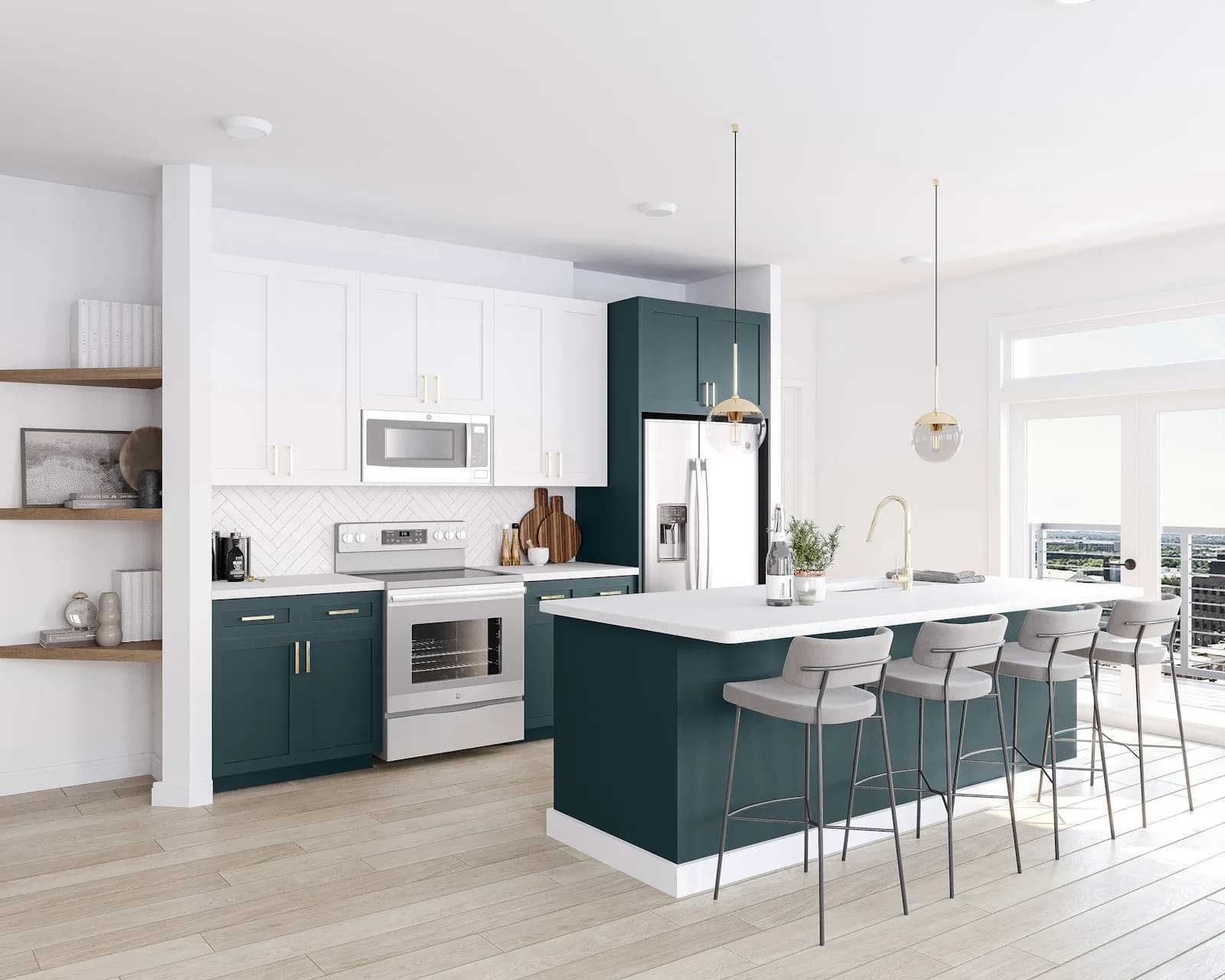
What colors make a house look expensive is a question we hear in our Winter Haven showroom almost every week. Most folks expect us to name a single paint color. We can't. The truth is simpler and a little surprising. The colors that read as high-end are warm, quiet, and consistent. And the biggest one in any room is the floor. We've been fitting floors, cabinets, and counters in Polk County homes since 1962, and the homes that feel expensive almost always share the same palette: warm neutrals, repeated everywhere, with no jarring breaks.
This article is about interior finishes, not exterior paint. We're talking about the surfaces you live on and touch every day. Floors, cabinets, and countertops set the color story of a home far more than the wall paint does. Walls are easy to change in a weekend. Floors are a fifteen-year decision. Let's walk through the colors that pull their weight.
Why Warm Neutrals Read as High-End
Cool gray ruled for about a decade. It looked clean in photos. But in person, gray can feel flat and a little cold, especially under Florida's bright natural light. Warm neutrals do the opposite. Honey oak, soft greige, creamy white, and warm taupe catch the light and give it back. The room feels calm and settled instead of stark.
There's a practical reason warm tones win here too. Polk County homes track in fine lakeside sand and everyday dust. A warm mid-tone floor hides that between moppings. Pure white floors show every speck. Near-black floors show it differently but still show it. Warm in-between tones split the difference and read clean for longer. Clean reads as expensive. Our post on the latest flooring trends digs into why warm mid-tones replaced cool gray across the market.
The Color Families That Work
- Honey and caramel oak: warm, forgiving, pairs with almost any cabinet color
- Soft greige: gray's warmer cousin, the safest neutral for floors and walls
- Creamy white and warm white: for cabinets and trim, never stark builder-white
- Warm taupe and mushroom: quiet backdrops that make wood grain stand out
- Natural white oak: the single most requested color we sell right now
Start With the Floor: It Sets the Whole Palette
The floor is the largest surface in any room. Pick it first. Everything else takes its cue from there. Get the floor color right and the rest of the house gets easier. Get it wrong and you'll fight it for years.
Right now the color that reads most expensive is warm white oak in a wide plank. Seven inches or wider. A matte or wire-brushed finish, never high gloss. Gloss shows every scratch and looks dated fast. Matte diffuses light and hides the small marks of real life. You can get this look in real hardwood or in a quality luxury vinyl plank that mimics it. Both can look high-end when the color and width are right.
Florida Slab Reality
Most Polk County homes sit on a concrete slab. That slab gives off moisture, and Florida humidity adds to it. Solid hardwood doesn't love that. Engineered hardwood and rigid-core LVP handle it far better. This isn't a color point, but it shapes which warm-toned product is right for your home. Our hardwood versus luxury vinyl plank guide lays out the trade-offs, and our slab moisture mitigation post explains why the subfloor matters as much as the color you pick.
Run the Same Floor Across the Open Plan
Here's the trick that costs nothing extra and makes a home look twice its price. Run one floor, in one color, across the whole main level. Kitchen, dining, living, hallway. No transition strips. No color change at every doorway. Continuity is the strongest high-end signal there is.
When the floor flows unbroken, the eye keeps moving and the space reads larger. Break it up with three different floors and three colors, and the same square footage feels chopped and cheaper. Builders often mix a tile entry, a wood living room, and a different kitchen floor to save money. It rarely looks expensive. One continuous warm floor almost always does.
Modern LVP is fully waterproof, so you can run it right through the kitchen without worry. Engineered hardwood works there too in the right home. If you do need a second material, say tile in a wet bathroom, keep its undertone warm and close to the main floor so the change feels intentional, not accidental. There's a real logic to limiting yourself, which we cover in the rule of 3 in flooring.
Cabinet Colors That Stay Timeless
Cabinets are the second-largest color block in a kitchen. They're expensive to change, so the color has to last. The cabinet colors that read high-end are the ones that don't chase a trend. Warm white. Soft greige. Creamy off-white. A muted sage or a warm gray-green for an island. Deep navy still works as an accent. These colors looked good ten years ago and they'll look good ten years from now.
Skip the bright, trendy color on every cabinet. A loud kitchen dates fast and reads cheap once the trend passes. A two-tone kitchen is the smart move: a warm neutral on the perimeter and a deeper or contrasting color on the island. It looks custom without the risk. We build both custom and semi-custom cabinets, so the color and door style are yours to choose. Our kitchen design 101 guide walks through layout and color together.
Pair Cabinets to the Floor's Undertone
- Warm honey floor: pair with creamy white or warm greige cabinets
- Light natural oak floor: pair with crisp warm white or soft sage cabinets
- Mid-tone chestnut floor: pair with off-white perimeter and a deep navy island
- Always match undertones. A warm floor wants warm cabinets, never icy gray.
If you're weighing whether to spend on full custom or save with semi-custom, our custom vs semi-custom vs stock cabinets post breaks down where the money goes and where it shows.
Countertops: Where Quartz Quietly Wins
Counters are eye-level and you touch them constantly. The color and material here can make a kitchen feel rich or flat. For a high-end look that lasts, we point most homeowners toward warm-white or soft-veined quartz countertops. A creamy white quartz with a soft gray or warm taupe vein reads like natural marble but holds up to real cooking. No sealing, no etching, no stains from a glass of red wine.
Color matters more than flash here. A busy, high-contrast slab can fight the rest of the room. A calm, warm-white surface with gentle movement lets the wood floor and cabinets do the talking. That restraint is exactly what reads as expensive. Granite still has its place if you love natural stone, and our quartz vs granite post compares them honestly. If you've landed on engineered stone, why quartz countertops are the perfect choice covers the durability case.
Industry pricing helps set expectations. Installed quartz commonly runs in the $50 to $120 per square foot range depending on the brand and edge. Brand choice matters for both color and warranty. Cambria, Silestone, and Caesarstone each have a different look, which we lay out in Cambria vs Silestone vs Caesarstone.
The Mistakes That Make a Home Look Cheap
Color can work against you just as easily as for you. After more than sixty years of installs, the same missteps show up again and again. Most are about contrast and mismatch, not the colors themselves.
- Too many floor colors: three different floors in one open space chops it up
- Icy gray everywhere: cool tones read cold and flat under Florida light
- Stark builder-white walls against warm floors: the clash looks unfinished
- High-gloss floor finishes: they show every scratch and date the room
- Mismatched undertones: warm wood floor with cold gray cabinets fights itself
- A loud trend color on every cabinet: bold today, dated and cheap-looking in five years
If you want a deeper look at what the pros steer clear of, our post on what flooring interior designers say to avoid covers the floor side in detail.
Texture and Finish Matter as Much as Color
Two floors can be the exact same color and look worlds apart. The difference is finish and texture. A wire-brushed white oak with a matte finish looks rich and deep. The same oak in high gloss looks flat and shows every footprint. Texture catches light in a way that flat color never can.
The same goes for counters and cabinets. A honed or matte quartz feels more custom than a mirror-shine slab. A soft-close door and a clean, simple profile read more expensive than a busy raised panel. Color gets you in the door. Finish and quality close the deal. And finish only looks right when the install is clean: tight seams, level planks, and square cuts. A beautiful warm floor laid badly still looks cheap.
Putting It All Together in One Palette
Here's the whole formula in one place. Pick one warm neutral floor and run it everywhere on the main level. Choose a timeless cabinet color in the same warm family. Top it with a calm, warm-white quartz. Keep wall colors soft and warm, never icy. Keep finishes matte, not glossy. That's it. That's the palette that reads expensive in a Winter Haven home or a home anywhere else.
It works because every piece agrees with the next. Nothing fights. The eye relaxes. That sense of calm and continuity is what people read as quality, even when they can't name why. You don't need the priciest materials to get there. You need the right colors, repeated with discipline. Not sure where to start? Our flooring quiz gives you a quick read on what fits your home, and the guide to choosing the right flooring walks through it step by step.
The Bottom Line
The colors that make a house look expensive aren't loud or trendy. They're warm, quiet, and consistent: a continuous warm floor, timeless cabinets, and a calm quartz counter that all speak the same language. Color reads differently in your own light than it does in any showroom, which is why we'd rather show you samples in your own home than guess. Come walk the warm-tone floors and quartz slabs in our 8,000 square foot showroom at 1507 Havendale Blvd NW in Winter Haven, or contact us for a free in-home measure and call us at (863) 294-7355. We serve Winter Haven, Lakeland, Auburndale, Bartow, Haines City, Davenport, Lake Alfred, and Lake Wales. Ask about Wells Fargo financing if you'd like to spread the project over 12 or 24 months with no interest. We're grateful you'd consider letting our family help with yours.
More flooring tips
Have a project of your own?
Free in-home estimates across Polk County.